
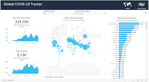
In the realm of data analysis for COVID-19, visualization serves as a powerful tool that enhances our comprehension of complex datasets and trends. Through visual representations such as charts, graphs, and maps, we can transform raw data into meaningful insights, making it easier for researchers, policymakers, and the public to understand the impact of the pandemic and identify patterns that may otherwise be overlooked.
One of the key advantages of visualization in COVID-19 data analysis is its ability to provide a clear and intuitive depiction of information. By presenting data visually, we can quickly discern trends, relationships, and outliers that may not be apparent when merely looking at numbers or text. Visualizations enable us to spot patterns in infection rates, identify geographic clusters of cases, and track the progression of the virus over time, allowing for more informed decision-making.
Furthermore, visualizations can help in communicating complex findings to a broader audience in a concise and impactful manner. Through interactive dashboards and infographics, stakeholders can easily grasp the significance of key metrics such as case counts, testing rates, and vaccination coverage. Visual representations can also aid in raising awareness about public health measures, dispelling myths, and promoting adherence to guidelines by presenting data in a compelling and accessible way.
In addition, visualizations play a vital role in fostering collaboration and data sharing among researchers and health professionals. By creating visual tools that allow for the exploration of datasets and the comparison of different variables, visualization platforms can facilitate knowledge exchange, enable peer review, and drive innovation in the development of new analytical techniques for understanding the dynamics of the pandemic.