
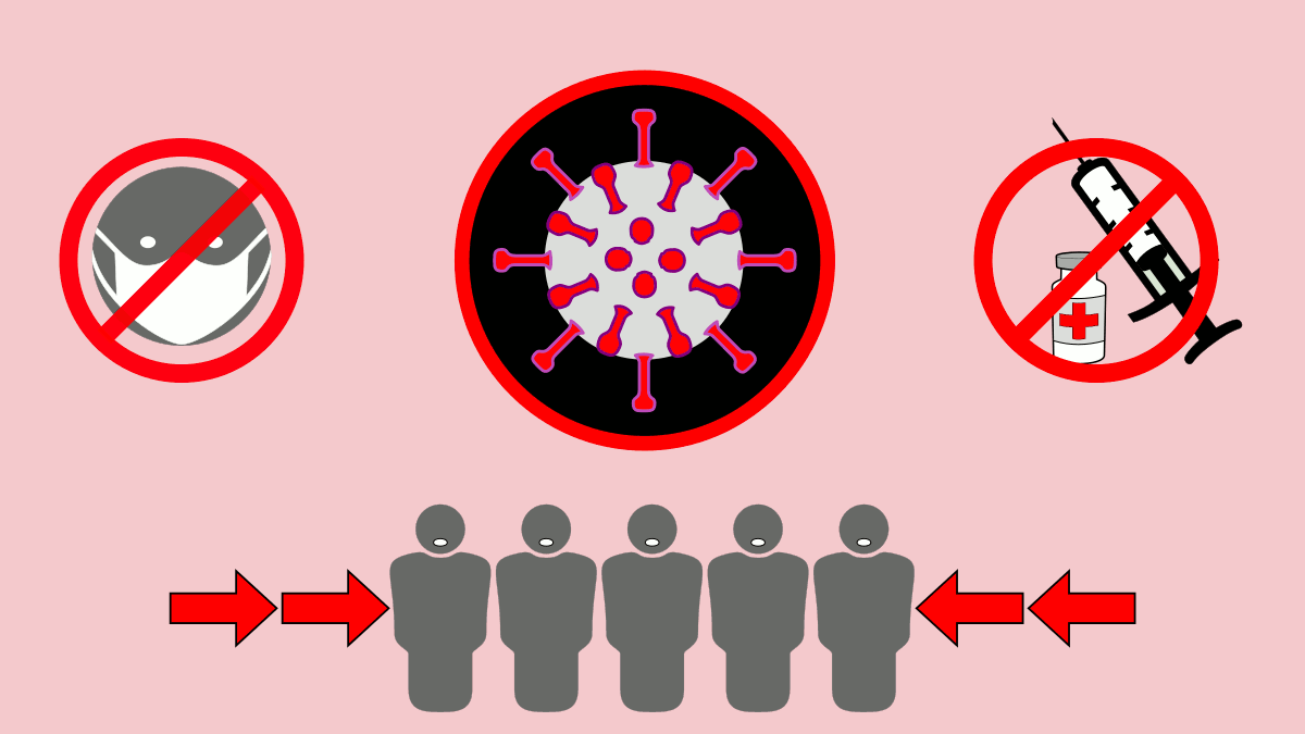
Covid 19 Pandemy
Turning COVID-19 Data into Clarity and Action
Visualizing COVID-19 Data: Insights for a Safer World
Welcome to our website dedicated to visualizing the latest data on the ongoing COVID-19 pandemic. Through informative graphs, charts, and maps, we aim to provide you with a comprehensive understanding of the trends and statistics surrounding this global health crisis. Stay informed, stay safe, and join us in our mission to combat and ultimately overcome this threat. Explore our interactive visualizations and empower yourself with knowledge to protect yourself and your loved ones.
Understanding the Pandemic: Our Data Visualization Services
At our website, we offer cutting-edge data visualization services that help you delve deeper into the complexities of the COVID-19 pandemic. Our skilled team uses advanced tools to transform raw data into clear, interactive visualizations that reveal insights and trends crucial for informed decision-making. Whether you’re a researcher, healthcare professional, or concerned citizen, our services provide you with a unique perspective on the pandemic, empowering you to make informed choices and contribute to a safer world for all. Explore our range of visualization solutions and unlock the power of data to navigate these challenging times effectively.
Visualizing COVID-19 Data: Empowering Knowledge for a Healthier Future
Discover the transformative potential of data visualization with our expert services dedicated to shedding light on the complexities of the COVID-19 pandemic. Through state-of-the-art tools and expertise, we translate vast amounts of data into visually compelling and easy-to-understand representations that offer valuable insights and actionable information. Whether you are a policymaker, healthcare professional, or concerned individual, our services are designed to equip you with the knowledge needed to navigate the challenges presented by the pandemic and make informed decisions for a healthier future. Join us in harnessing the power of data visualization to empower yourself and your community in the fight against COVID-19.
Latest Posts
-
روند کار
Read more: روند کاردر ابتدا نرمافزار زمپ را نصب و وردپرس را در آن بالا آوردیم. یکی از چالشهایی که در این قسمت با آن مواجه بودیم فعال نشدن آپاچی بود و دلیلی هم برای ارور شرح نمیداد. نهایتا با تغییر…
-
Economic Implications
Read more: Economic ImplicationsIn this section, users will be able to see accurate information about the health and human development status of their chosen countries. The first chart shows the incidence rates and vaccination levels in these countries, helping us better…
-
Government response and strictness
Read more: Government response and strictnessIn this section, users can receive comprehensive information about the health and economic situation of their chosen countries by selecting their preferred countries. The first chart specifically shows the incidence and mortality rates of diseases in these countries.…